My new favourite Writing Font
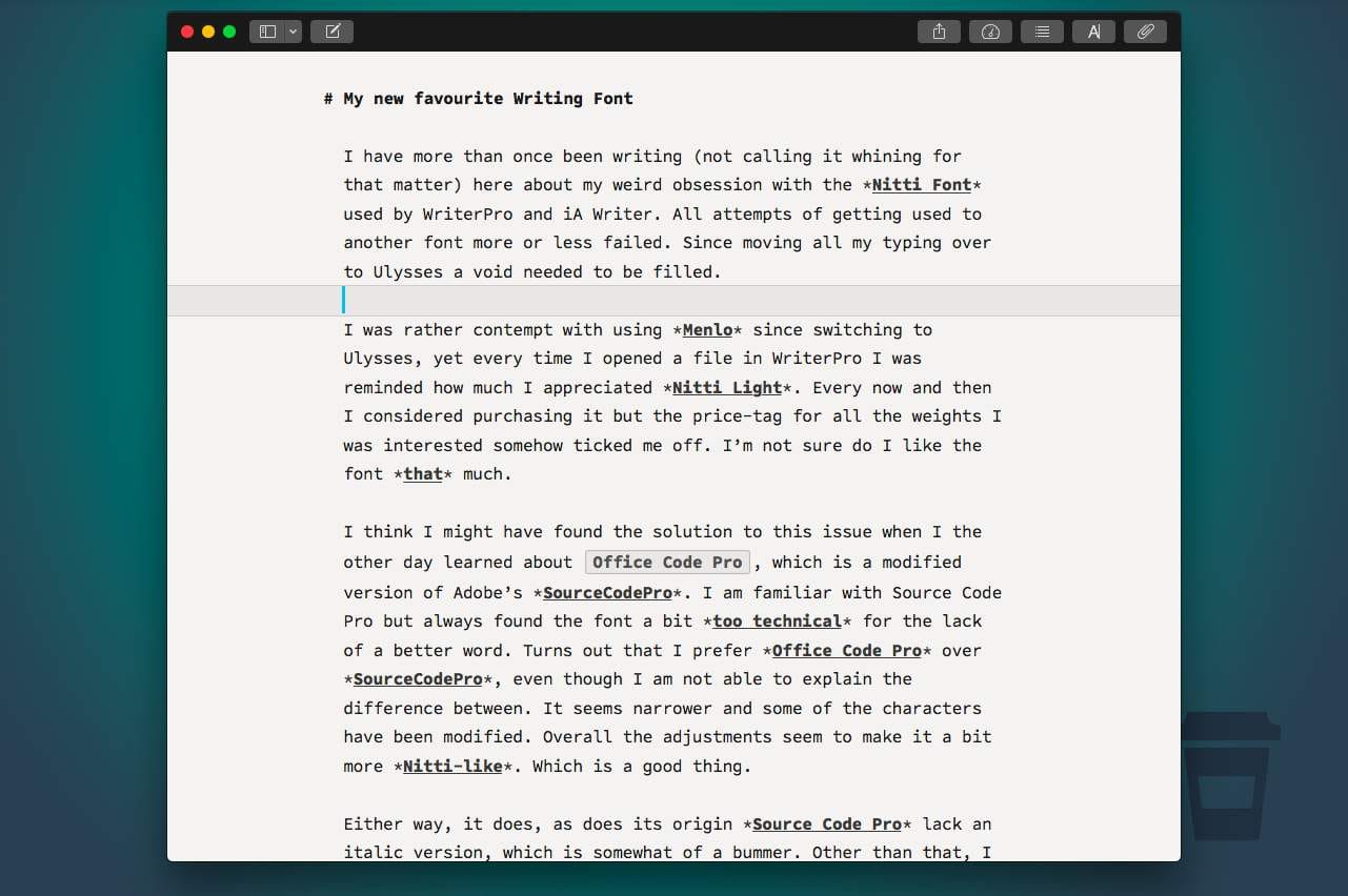
I have more than once been writing (not calling it whining for that matter) here about my weird obsession with the _Nitti Font_ used by WriterPro and iA Writer. All attempts of getting used to another font more or less failed. Since moving all my typing over to Ulysses a void needed to be filled.
I was rather contempt with using Menlo since switching to Ulysses, yet every time I opened a file in WriterPro I was reminded how much I appreciated Nitti Light. Every now and then I considered purchasing it but the price-tag for all the weights I was interested somehow ticked me off. I’m not sure do I like the font that much.
I think I might have found the solution to this issue when I the other day learned about Office Code Pro, which is a modified version of Adobe’s SourceCodePro. I am familiar with Source Code Pro but always found the font a bit too technical for the lack of a better word. Turns out that I prefer Office Code Pro over SourceCodePro, even though I am not able to explain the difference between. It seems narrower and some of the characters have been modified. Overall the adjustments seem to make it a bit more Nitti-like. Which is a good thing.
Either way, it does, as does its origin Source Code Pro lack an italic version, which is somewhat of a bummer. Other than that, I really like the clean and crisp look of it. In fact even more so than Nitti Light. It is easily readable even in rather small sizes[^-361149552] and it is even more beautiful with a dark theme. At times Nitti started to feel bit of grungy on the desktop and somehow didn’t really look sharp.
Since I was already at trying fonts again I started to fiddle around with a few more. I tried Fira Mono, Input and eventually Cousine, which I used to use a lot a few years ago. I like all of them and all of them have something about them that I like, but overall I enjoyed Office Code Pro the most. It is the cleanest, feels light, is very easily readable in all sizes and looks good in both dark and light themes. Sounds almost too good.
The Test
Since I might have found a font that I like I thought the best test would be to stick with the font for a while and see if it sticks.
The plan, or challenge is to stick with Office Code Pro until the end of May and not try or switch to any other font. I actually went so far to remove all other custom mono-spaced fonts from my system to avoid the temptation. Also for the sake of a consistent experience, I installed the font in my editors on iOS (yeah Ulysses/Daedalus. This is in fact is a nice added feature in both apps.
At the end of May I will let you know, how the challenge worked out and if doesn’t feel right by then I will give another font a try. But not before June the 1st of course.
If you are interested in the font as well, you can find it here on Github.
Note: I have no knowledge about typography whatsoever other than that I prefer some fonts over others just based on aesthetics and personal preferences.
- I usually prefer not too small sizes, but still with this font it almost makes sense ↩