A Mono-spaced Rabbit Hole
Over the course of the past week I have managed, yet again, to spent a stupid amount of time in trying to find a "nicer" (whatever that means) mono-spaced font, and in the process learned that the setup that I was using, is still the one that I like best. Who would have thought?
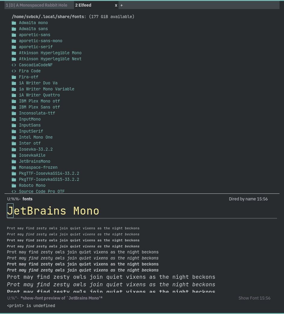
The mono-space-font that I am most comfortable using is JetBrains Mono, a font that I am using for, I don't know, a couple of years I guess, already, Which likely is also the reason I wanted to look for something else.
What this "something else" could be was of course 100% unclear to me and I went on a quest to figure that out. And it was a long and annoying one.
I researched, and looked at samples, installed fonts and trialed them with my Emacs configuration in a selection of my favorite themes in both light and dark backgrounds and in combination, because deciding on ONE FONT isn't enough, with some variable spaced fonts.
This had been as tedious as it sounds, and in the end I had a hard time separating fonts from each other.
I know next to nothing about typography in general, but I know what I like - or at the least like to think so - but my main issue usually had been that some of the fonts were either too wide, or too narrow, too high or too low or simply the built-in line-height felt too small. It's strange.
And what can I say, JetBrains Mono always looked the cleanest to me! Then again it is the one that I have been using for quite some time. I did though settle with a different variable pitch font and am trialing IBM Plex Sans at the moment.
And to add insult to injury: now that I am writing this, I of course had some doubts and tried Prot's Aporetic font again, and what can I say, all of a sudden it looks much better than earlier!
Or I think it does… I am literally loosing it by now.
So, the solution for now, will be to stick to the JetBrains Mono now, but I will add the Aporetic font as an alternative setup. This way I can then can drive myself even more crazy by switching between the two setups back and forth.
To make all of this a little easier I used two packages by Prot, namely Fontaine to configure the fonts and the Show Font package to preview them.
Related: It turns out that I did similar almost exactly 10 years ago. I guess I never learn.
100 Days to Offload 9/100